LYRRA
Methodology
Research Stage
qualitative & quantitative
Competitor analysis & benchmarking User survey
Ideation
3 rounds
3 timed brainstorming sessions · 5 min each · 97 ideas generated
Testing
Usability testing · 15 participants
- Project type
- web application, generative AI
- Role
- ui/ux design, product strategy
- Medium
- career tech platform
- Tools
- Figma · Clickup · Miro
The Lyrra App tackles the confusion of the job application process by offering job seekers user-centered guidance and clarity.
By integrating AI generation into a unified platform, my role was to reduce application abandonment and empower individuals to present themselves effectively to the job market.
Job seekers at all career stages who feel overwhelmed by the application process, and companies seeking to attract qualified candidates through streamlined digital tools.
- Blank pages trigger decision avoidance.
- Scattered steps cause cognitive overload.
- Low-friction structure builds momentum.
- Welcomes smart assistance that never takes away control.
How might we turn complex, high-anxiety workflows into supportive spaces where users feel confident, focused, and in control?
job seekers feel lost and overwhelmed by the complexity of the required application materials, leading to abandonment. This gap in the process costs companies potentially valuable applicants.
The Unified Assisted Workspace
Lyrra is a tool that transforms the overwhelming anxiety of the job search into confident action. We break down the barriers of complex application materials, giving users a supportive space to easily craft their story

Research Insights
Users do not just get lost in the UI; starting from scratch creates decision paralysis that can stop momentum before the application process properly begins.
Users want support with phrasing and communicating their experience, but trust decreases when AI begins replacing their individual voice rather than assisting it.
Moving repeatedly between a template library, text editor and AI interface increases cognitive load and fragments the application workflow.
Designing a calmer application workflow
Our scope is to reduce job application abandonment by transforming confusion into professional success and empowering individuals to present themselves effectively in the job market through professional tools.
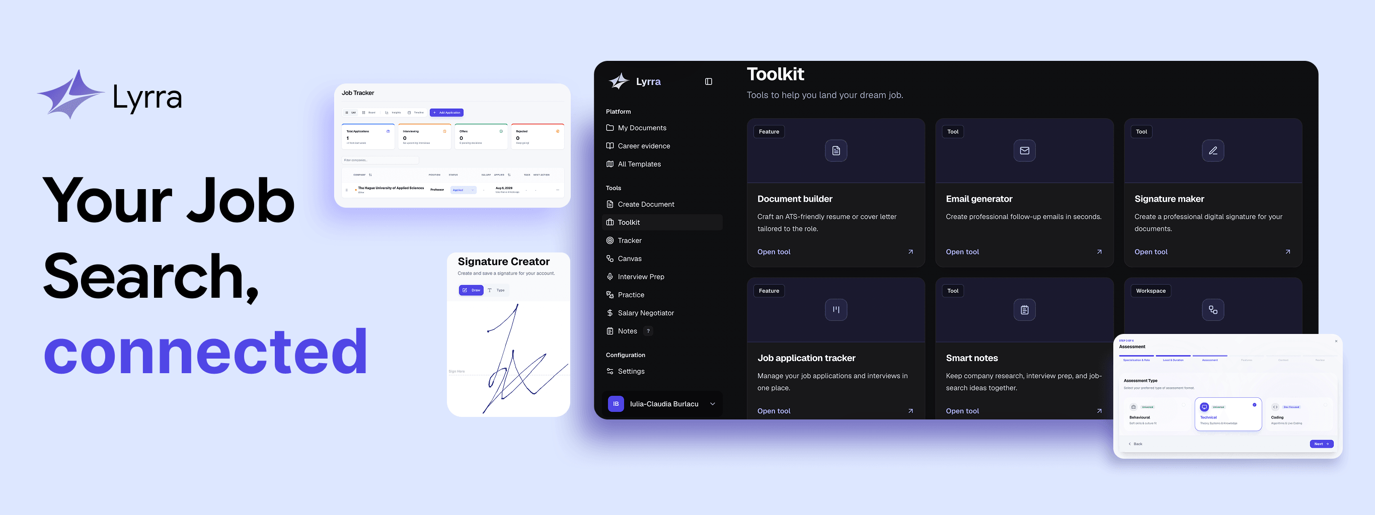
Guided First Steps
Replace the blank page with structured prompts that scaffold the user's first input, reducing decision paralysis before it takes hold.
Instead of beginning with an empty field, Lyrra introduces contextual prompts based on the user's target role and industry. The blank page becomes a sequence of smaller decisions, helping users establish momentum from the beginning.
““The step-by-step profile builder and clear quick-start guided me effortlessly without overwhelming me.””
Participant 03, Onboarding Flow Test““Switching fields meant constantly reframing my past work. The collapsible profile sections made organising painless.””
Participant 07, Usability TestHuman-Anchored AI
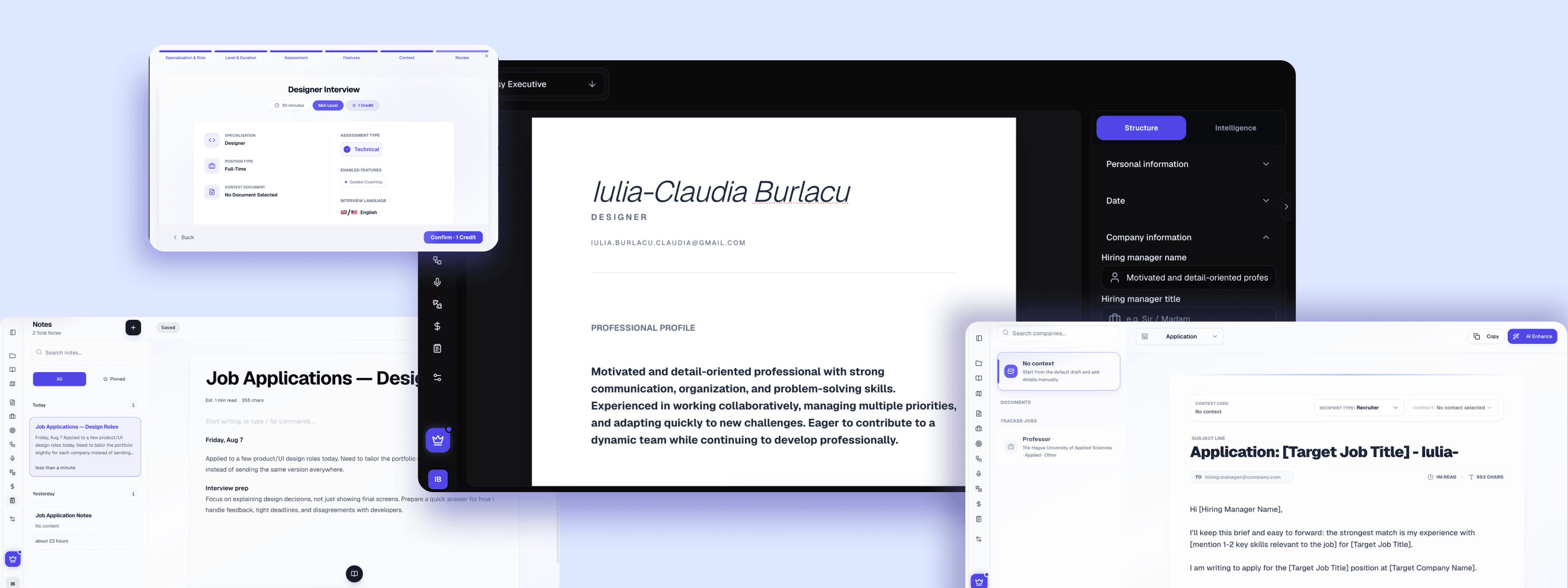
Position AI as a collaborative editor that suggests refinements while preserving the user's authentic voice, building trust through transparency rather than complete automation.
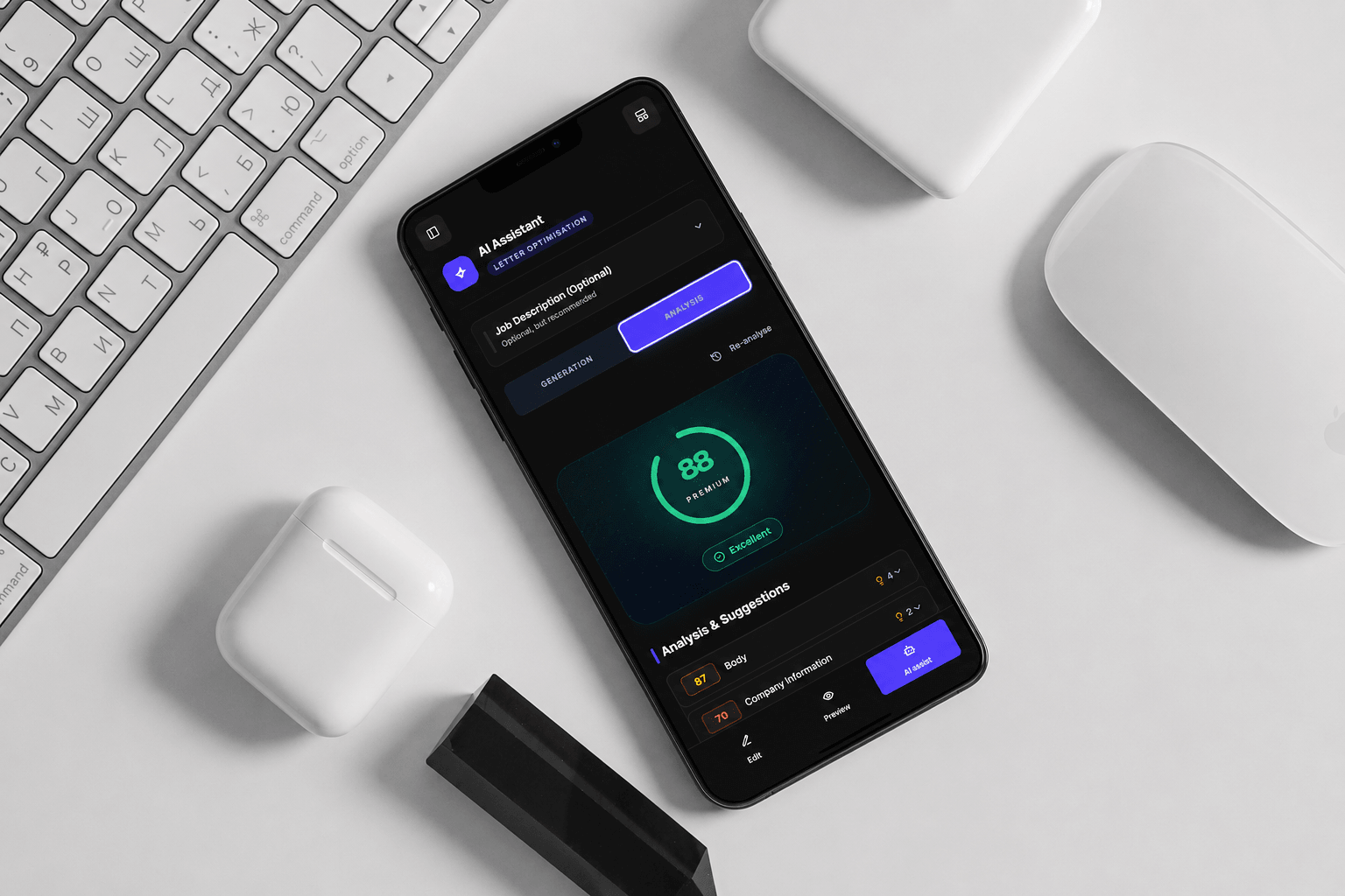
AI suggestions are presented as optional improvements with a before/after preview. Users can accept individual edits, reject them or adjust the tone, keeping control over how their experience is communicated.
““Having real-time phrasing suggestions right alongside the preview gave me instant direction.””
Participant 05, AI Trust Assessment““The AI Writer suggested punchy, active verbs as I typed, giving me absolute confidence in my phrasing.””
Participant 11, Usability and Desirability Test““Being able to add my real signature directly onto my cover letter was such a nice touch.””
Participant 04, Usability TestUnified Workspace
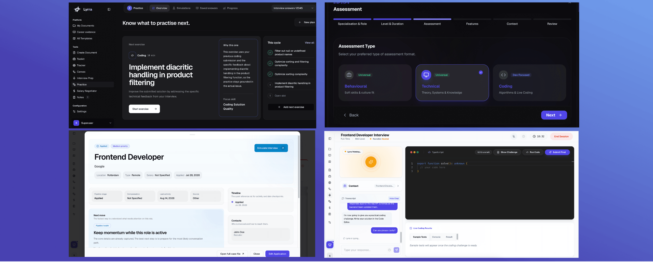
Merge the template browser, text editor and AI assistant into a single interface, removing context switching as a source of cognitive friction.

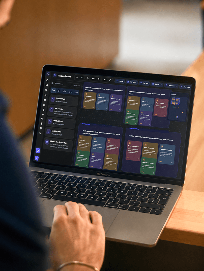
The layout keeps templates, the working document and AI guidance available within the same environment. Users can explore templates without losing their draft and apply AI refinements without navigating away from their work.
““I like that everything I need is right there. I’m not going back and forth between different screens, so it’s easier to stay focused on what I’m doing.””
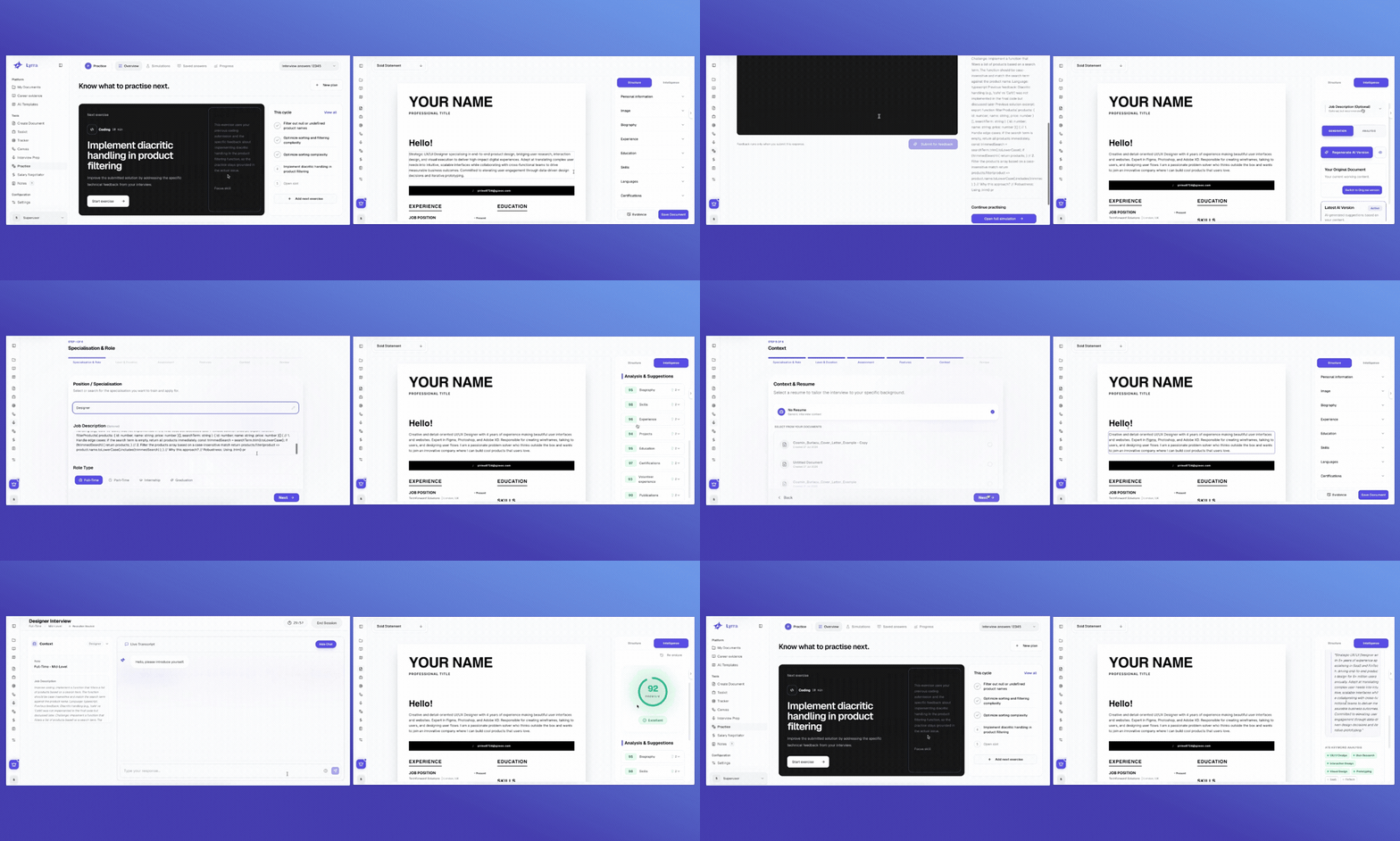
Participant 02, Usability TestLyrra in context
Our scope is to reduce job application abandonment by transforming confusion into professional success and empowering individuals to present themselves effectively in the job market through professional tools.
What the work established
The current outcomes describe the product direction and the measurements planned for post-launch validation.
Document creation, AI guidance, and review remain in one workspace, interconnected and easily available.
planned
A product-direction outcome; production impact has not yet been measured.
Validate task completion, abandonment, and user confidence after launch.
planned
A post-launch measurement plan, not a reported result.
Understanding Lyrra meant acknowledging that it was never about feature bloat or aggressive automation. Users do not stall because they lack creativity; they stall because empty slates, fragmented tools, and cognitive overload drain their momentum.